

A landing page is all about motivating readers to take action. Motivating them to scroll through your page, to focus on key messages, and ultimately – to click that call-to-action (CTA) button. The landing page copy needs to make the case, and it needs the landing page design to help out.
Using directional cues, the landing page design can induce visitors to scroll so they actually see benefits, testimonials, and all the other copy elements that make the case for action. Different types of directional cues you can incorporate into your landing page design are:
- arrows
- pointing
- lines
- asymmetrical layout
- encapsulation
- color
- the hint of more to come…
We’ll take a look at some specific examples in a second, but I want to emphasize one point first: Every design element in your landing page should have a specific purpose; anything that’s nothing more than decorative only detracts attention from the parts of the landing page that motivate action.
Just as copywriters need to edit copy (and then edit again) – designers need to edit their landing page design. If you don’t know how a specific design element supports the goal of focusing eyes where you want them, leave it off.
[tweetthis]Just as copywriters need to edit copy – designers need to edit their landing page design.[/tweetthis]
Giving Directions: Arrows
I never said the design element had to be subtle, just useful. Arrows are popular and effective elements to add to a landing page. They direct the visitor exactly where you want them to go.
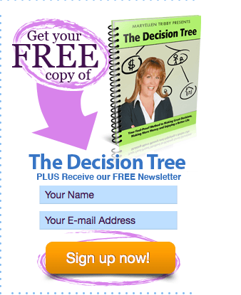
In this example, from Working Moms Only, a brightly colored arrow is used within the signup form itself.
In this next example, the arrows are used to direct us to the signup form.

You can also use arrows to guide readers to more information. In this example from Paymo, they use a small, but easily noticeable, arrow icon as part of a secondary call-to-action below their primary call-to-action, the sign up.

Both call-to-action design elements are in the stand-out, brightest green on the page, confirming what we already know about using bright, contrasting colors as a directional cue in their own right.
What’s particularly valuable here is that their close proximity and design consistency draw all readers’ eyes to the same place. If you’re a visitor who’s ready to sign up – click that button. If you need a bit more information – you’re still in the right place, just click the down arrow. In this way, Paymo is making sure that its two options for action on the page aren’t competing. Their directional cues take you to the same place.
Getting to the Point
Another, equally unsubtle, option to the arrow is to use an image to just point the visitor where you want her to look. Here’s how Basecamp does it:

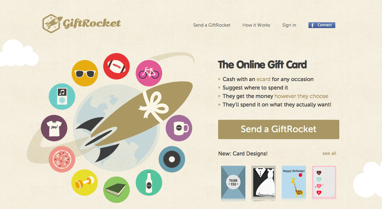
If you want something slightly less subtle than a guy waving “hey, look over here!”, then GiftRocket provides a model. The rocket breaks through the circle and draws the eye to GiftRocket’s primary list of features and benefits.
Another effective pointer is using a photo of a human looking to the area on the page you want your landing page visitor look and not looking back at the reader. There’ve been a number of studies showing that people like looking at the faces of babies and attractive women. However, you don’t really want your visitors staring at the picture, you want them to focus on your copy! Fortunately, the same studies show that when the baby or pretty lady in the picture has their eye gaze directed to another element on the page, that other element also gets the reader’s attention.
Wrap It Up
Encapsulating important copy within a discrete area also highlights that area for special attention. In the first example, a strong contrasting color and shading are used to box up the call-to-action form.
In the example below, the encapsulated form uses a gradient bright color, so a brightly colored outline to the look-up box is also apparent. This look-up box also takes advantage of some asymmetry to stand out (more on asymmetry below).

This last example shows how to use encapsulation over a busy photo and still stand out. The use of two complementary, contrasting colors within the box along with the white arrow pointing to it is a nice combination of directional cues without being messy.

Vertical Lines
Landing pages differ from other web pages in their overall design in that a landing page is only one page. Usually, web pages on a site will have all sorts of links to other web pages. In contrast, you don’t want anything on the landing page pulling visitors away from it instead of taking action on it.
Because all the information you want to provide has to sit on one page, landing pages are invariably longer than what one screen can hold. Even though most landing page visitors get this and expect to scroll down, people do still tend to follow direction. So when you use vertical directional cues to move people downwards, they’ll move deeper into your landing page.
[tweetthis]Use vertical directional cues to move people downwards, and they’ll scroll deeper into your landing page[/tweetthis]
Here’s a simple example from a design template that’s clean and practical. The white vertical line extends below the benefit list area, which naturally pulls eyes downward as well.

This design template also uses the vertical line to emphasize another directional cue: asymmetrical elements. The line itself clearly moves between two distinct areas on the page, the upper misty grey area and a solid white section. However, the designer here also used the image of the smartphone, which is crossing both sections, to create some asymmetry that also pushes our notice down.
The Promise of More to Come
Another way to motivate people to scroll down through your landing page is to provide a hint “above the fold” that there’s more below.
The image above is the full above-the-fold homepage of SproutSocial. The screenshot they’re showing is clearly cut off at the bottom.

A bit like the smartphone in the template above, a cut off image naturally makes us curious to see the entire thing. However, when you do scroll, you’ll see:

There is no more to the image, just a nice testimonial in a bright green band. Made you look!
Shortstack seems to use a combination of asymmetry and hint of more to come on its above-the-fold portion of its page. I say “seems” because I wonder if it’s too subtle to be effective, or even intentional.

The second section, below the call-to-action button, is wider than the top. But since it’s also white, I find it hard to notice. You also see the skimpiest hint of another image in the lower lefthand corner. Again, I wonder if that’s sufficient to pique a reader’s interest to see what that image is.
Both the asymmetry and partial image directional cues can be effective, but I think they need to be more noticeable than this example when used.
The example below is from the nonprofit One.org. By the time you’ve scrolled down to this persuasive bullet section, you’ll just see that cut-away arrowhead in the “Join now” call-to-action. One little scroll further and you’re at the sign-up form.

Purpose with Creativity
I hope you notice that not only do these design elements serve a practical purpose, but they also present it within the visual brand of the companies or organizations represented.
Arrows and boxes may be common elements to have on a landing page, but that doesn’t mean yours have to be boring or mundane. The directional cues may fall into just a few categories, but the specific execution of any one of them, or combination, is limitless.

Elisa Silverman is a B2B content writer with a background in law and technology, who’s spent a career helping diverse groups of people communicate well with each other.

