Have you ever noticed how fast food companies all seem to make use of the same basic color palette? The industry is dominated by red and yellow, and the few brands that don’t use those colors make use of orange, pink, and other warm, bright colors. Why is this? Enter color theory. Color theory dictates that some colors have the intrinsic ability to evoke certain feelings or behaviors in people. If you’re aware of these hidden properties, it’s possible to turn them to your advantage as fast food companies have.
It turns out that the color red acts as a stimulant, triggering appetite, hunger, and attracting attention, while yellow creates a sense of speed and urgency. Taken together, you can see how these attributes work well for a fast food company. Now, think about your own website and its landing pages. When you sat down to do the design, how did you choose colors? It’s most likely that you simply went with the colors that you were used to using from your brand identity, without consideration of color theory.
It can pay to do a deep dive into color theory to better analyze what your use of color says about you, and see how you can make the psychology of color work for you.
Color theory: a wide topic
Even though color theory has a long history, there is still a lot we don’t know about it. Painters and other artists have of course been aware of and using color theory for hundreds of years, but its history usage in business and marketing is much shorter.
[tweetthis]Artists have been aware of color theory for hundreds of years, but its history in marketing is shorter.[/tweetthis]
One of the first modern articulations of color theory was created about a hundred years ago, developed by Albert Munsell. He created a three dimensional framework for understanding color by defining it according to hue, value, and croma. In the past few decades, the use of color theory has come to web design, and web designers have worked to create how the human brain understands and processes color in a digital context.

Applying color theory to your landing pages
Lately, online marketing and the advent of the bounce rate and other engagement metrics has brought color theory once again to the forefront of people’s attention. When you measure someone’s attention span in seconds, every little bit helps. If color theory can help in those first few crucial seconds when a user decides to bounce or not, it’s worth looking into.
[tweetthis]Instead of arbitrarily voting for color choices that look nice, you can ground decisions in real theory.[/tweetthis] There are two important ways designers can use color theory to inform the choices they make when designing landing pages: by creating contrasting color combinations to improve aesthetics and readability, and more importantly, by taking advantage of the aforementioned psychological effects described by color theory. Instead of just arbitrarily deciding that your color choices look nice, you can ground your design decisions in real theory. Doing this will help ensure you’re maximizing user engagement and minimizing the chance that they’ll bounce away.
A note on color choices and readability
It can be tempting to go super minimal when designing a website. Minimalism is appealing because it allows you to feel you have more control over the user’s eye when navigating, by being very spare in your color use, you can more easily draw the eye to certain areas of the page that you wish to highlight. However, color makes your page stand out. It’s one of the easiest ways to differentiate your website from the general blue of the internet.
Using contrasting colors can make your website seem fresh and interesting; our brains naturally interpret contrasting color as a bold design choice, and your site and landing pages will seem more interesting because of it.
How to find complementary, yet contrasting colors? Use a color wheel. A color wheel is an ancient tool used to show relationships between primary, secondary, and tertiary colors. You don’t need to get too advanced—contrasting colors are the ones opposite each other on the color wheel. There are plenty of color wheel tools on the internet that can help you choose bright, contrasting colors (combine this tool with a business name generator, and you could have a completely computer-generated brand identity).
The psychology of color
Now into the nitty gritty of color theory. This is what you came here for. Each color brings with it not only its unique appearance, but its unique influence on human mood and emotion.

Take a moment to think about the colors you’re using, look over the table, and see if you’re projecting the feelings you want to be.
Red
Coca Cola’s website showcases the power of red  Red is a visceral, physical color. The color of blood. It quickens the heart rate and promotes a sense of urgency, and imparts a sense of courage, strength, and defiance. It’s one of the most powerful colors.
Orange
Easyjet shows how orange can mean “book now!” It also showcases use of contrasting colors  Orange is another aggressive color and is very useful for a call to action. It seems lighthearted, warm, and safe. It complements with blue very well.
Yellow
Yellow is the color of youth: optimistic and playful, creative and spontaneous. Yellow is accessible and highly visible, and in that way it is also a brave color.
Green
Subway shows how color can be used to complement brand values,in this case, Subway’s value of freshness.  Though green is often associated with money for obvious reasons, this association is not the most powerful of green’s properties. Rather, green is a soothing, natural color, capable of instilling a sense of security and serenity in your page. Green is a great color for websites that need to instill a sense of trust in their visitors.
Blue
Blue is a sincere color. The color of water and sky, it’s maybe the default color of the internet. For this reason, its associations online are not as strong as other colors. It is the least impulsive and least spontaneous color, associated with logic and cool headedness.
Purple
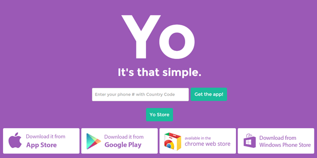
Yo demonstrates how purple can invoke a sense of simplicity and honesty

In some ways, purple works as a combination of blue and green, imparting a sense of safety and security while also seeming honest and good intentioned. It has a bit of a mystical quality to it.
Pink
A romantic, feminine color, pink can be powerful when used correctly, but also has the ability to alienate certain demographics, who might feel excluded by it. Because of its gendered associations, pink must be used carefully, as its use in the wrong context can sometimes feel patronizing or pandering. It’s very difficult to find a sports website that uses pink as a main color.
Black
Black is sophisticated and luxurious. A high-class color, it shows confidence, taste, and feels technologically sophisticated, even a bit expensive. A very masculine color, it can be seen as the male counterpart to pink, and likewise can be a bit alienating to certain more feminine demographics.
Color theory in landing page design
[tweetthis]A competent color strategy on a landing page can make the difference between a bounce and a conversion.[/tweetthis]Taking color theory into account when designing your landing page gives you more control over the way it impacts your visitors. In a sector where success is measured in the difference of a few seconds, having a competent color strategy on your landing page can make the difference between a bounced visitor and a conversion. Though other factors are obviously also important to landing page success, color is one of the least appreciated ways that you can make an impact on your visitors. Paying attention to color is a great way to be more aware of the effect you’re having on your users, and how your input can affect their behavior. What do your brand colors say about your company? Let us know in the comments!
Nick Rojas is a business consultant and writer who lives in Los Angeles and Chicago. He has consulted small and medium-sized enterprises for over twenty years. He has contributed articles to Visual.ly, Entrepreneur, and TechCrunch.
You can reach him at NickAndrewRojas@gmail.com


