At Pagewiz, we’ve created a detailed design document on which we base the creation of each of our new landing page templates. We test each design thoroughly, to make sure it meets the quality criteria we’ve set.
In this article, we will explain part of the process to show you some of what we do behind the scenes for each new Pagewiz template!

As with any design process, there are many stages from the first idea to the finished template. Once we have an idea what industry or business type the template pack should serve, we go through these steps:
- Research
- Wireframe
- Design
- Testing
- Creating a version optimized for mobile devices
- Building the page on Pagewiz
- Launching and promotion
[tweetthis]In each pack, we give each template a unique color palette so users can choose what’s best for their campaign.[/tweetthis]
Research

Here are the steps we go through for researching new template designs:
We start by looking for real examples, landing pages and websites real companies use. Business owners know better what they need than template designers, so we look at what businesses actually use, not at what’s in other designers’ portfolios. When we were researching webinar templates for this pack, we found that larger companies tend to ask for more details in their registration forms than smaller companies do. We usually recommend using the smallest number of fields possible to get more leads, but when you want really committed people for your webinar a longer form worked better. You may get fewer leads, but you’ll get to know before the event if the campaign has found the exact type of people you want there.
Forms in use for webinars often ask detailed questions like: “Are you a marketing agency?” “What is your company name?” “What country are you from?” “What is your business type?”, and so on. It’s part of the deal: Your visitors are more likely to provide you more details when they expect to get a significant offer in return. Using the Pagewiz builder you can easily change any of the form fields to match your own needs.
The content of a webinar page can range from the barest details to never-ending pages you have to scroll down and down. A form for an official Facebook webinar, for instance, can get by with just a headline, two sentences, the event date and a “Register” button; but an invitation to a physical, face-to-face seminar needs to provide more details. People want to know about the presenters, read testimonials, have an idea of the schedule, and understand what they will gain from attending. Without those details, they may never bother to sign up, much less attend.
For the webinar pack we made templates for both sparse and detailed pages. You know the audience you are trying to reach better than we do, so you can choose the template that will speak most clearly to your audience.
Next, we see what the good parts are in the collected pages. Content is key here rather than beauty at this stage. We’ve found inspiration in some of the ugliest pages you can think of. We then turn those bits into a polished diamond. It makes us feel like one of Xzibit’s technicians at “Pimp My Ride”, the show that takes ugly cars and turns them into tricked-out vehicles. We also want to please our current clients first, so we will also make sure to look at relevant Pagewiz clients pages for more examples and inspiration, then build a library of screenshots to study from all the researched pages.
Now the study begins! We try to make at least eight different needs or styles per template pack using what we’ve found as inspiration. Once we have some ideas down that impress us, we go to the next step.
Wireframe

Wireframing is all about layout. What goes where? We take the ideas we have and lay them out in different combinations using this process:
- First, we make a simple wireframe using pen and paper.
- Then we use Adobe Illustrator for a detailed sketch.
- Finally, we make bullet lists with all the text content and design elements each template needs. The list is sometimes as rough as these illustrations.
Building a proper wireframe at the start saves time later on. Once we have some preliminary template layouts, it’s time to go to the next step.
Design
The wireframe gives us the skeleton. Now we flesh it out using our design expertise!
Colors

We start by picking a color palette that fits the industry needs, based on our research, then stretch the limits to find top notch design inspirations. This helps us upgrade the look of whatever is already out there. Color is one of the first things the average person landing on a page sees, so we start there. We use sites like Behance and Pinterest to inspire us, as well as non-traditional sources, to find pallet ideas that work great.
In each pack, we give each template a unique color palette so users can choose what’s best for their campaign. We also provide for every pack some very simple, almost non-color-related templates that use an image as the main focus. Because there are no special icons or complicated graphic elements, you can change the stock image we provide to any image you’d like to use.

The top of the page (AKA above the fold)
This is the most important place on the page, so we have to make sure that:
- The call to action and main message are at the top.
- The sign-up form is located above the fold, or at least starts above the fold.
- The top section should remain wide and attractive.
The grid
Since ~12% of the screens today have 1024px or smaller resolution, and you don’t want any of your landing page visitors to scroll left and right to see the content, At Pagewiz we recommend setting your content section to no more than 1000px wide. However, part of making the design modern-looking is giving it a wider look, so we set the background image (as opposed to the site content) to 1920px wide. This combination helps make displays look good for any screen size.
Testing
At this stage, we’ll review that our design satisfies every line in our wireframe and design notes. About 80% of the requirements are related to lead generation, like these:
- Enough color contrast in the call to action (CTA).
- There’s enough white space around the CTA.
- There are directional cues to send readers to the CTA.
- The page has only one purpose, one action, and one idea.
- Colors are related to the industry or market segment the page is built for.
Around 20% of the lines in our requirements relate to principles that support a clear and impressive design, stuff like:
- Spacing is consistent throughout the page.
- The page has a clear color palette, giving it a unique and consistent look and feel.
- Clear typography hierarchies (Headline is the most dominant, CTA second, and so on).
When we develop our templates, we do them in several iterations. Once the basic design is set, we then test the template ourselves. Our development team puts the design through its paces to make sure all of the elements work well together. If something doesn’t work or is too finicky for our users, we go back to an earlier stage and make it better. By making our templates easy to use now, we save our customers from frustration later.
Designing a version optimized for mobile use

If you’re a junior designer, listen up real good right now! We want to share some secrets about the way to create a perfect mobile version of any desktop web page.
Simply applying the same font sizes of the 1000px desktop version to the mobile version is insane, but it happens a lot in bad responsive design. The screen on a mobile device is much smaller than a computer screen, but if you just reduce everything, the text will be too small for the user to read.
You do want to reduce photos, but you don’t want to reduce font sizes. In fact, you have to enlarge the font sizes so the text will be easily readable without people having to zoom in.
How much do you enlarge? Exactly 127% , assuming that the text size is around 18px-22px.
After you enlarge your page content 127%, put the enlarged version above the small 540px artboard, and it’ll look like this:

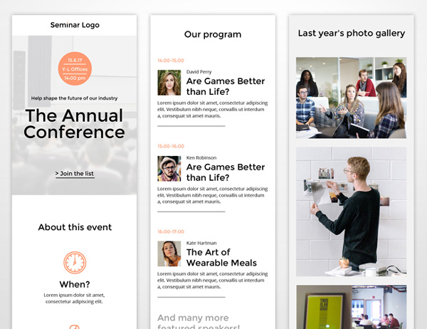
Now it’s time for the adjustments. Apply 30px spacing on both sides of the page and move the content to a single column. From there, it’s just a few design tweaks to get something like this:

Preview: Desktop Version | Mobile Version
Building your page on Pagewiz
Just to refresh your memory, here’s the process for building a page on Pagewiz. This presumes that you have mocked up your design in Adobe Illustrator/Photoshop:
- After creating a new Pagewiz page, choose “Blank Page”.
- Measure each section in your Illustrator/Photoshop design and build sections with same dimensions in Pagewiz.
- Export Illustrator’s whole artboard and place it as an image in Pagewiz for reference.
- When you select the image on the Pagewiz interface, set the Top (y) to zero.
- Lock the reference image.
- Using the reference image as a guide, build your page using the Pagewiz interface and make it come alive!
Using a reference image like this will speed up your workflow dramatically since you don’t have to take measurement after measurement. Here are some other tips to make your page buildout much simpler.
[tweetthis]Here are some tips to make your page buildout much simpler.[/tweetthis]
Tips for importing your Photoshop/Illustrator design to Pagewiz
- PNG for any transparency and gradients; JPEG for photos.
- You can add the Hex number for the color in Headlines simply by pasting the number into the white field (where you see “rgb(0, 0, 0)”).
- Always optimize your photo size – make the image small while maintaining high quality. Use the Photoshop legacy option “save for web”, or a service like “tiny PNG”.
- Use rich-text is for paragraphs, headlines for one-line sentences.
Launching and promotion
Ready to see what we’ve come up with for our new Webinar templates? Here you can check out our new Webinar templates pack. Leave us your comments and let us know what you think!
Re’em is Pagewiz’s brand manager. A seasoned designer and strategist who leads the company’s design and marketing processes, he takes part in both creative and strategy operations and is in charge of Pagewiz storytelling from the ground up.


