Do your thank you pages look like this?
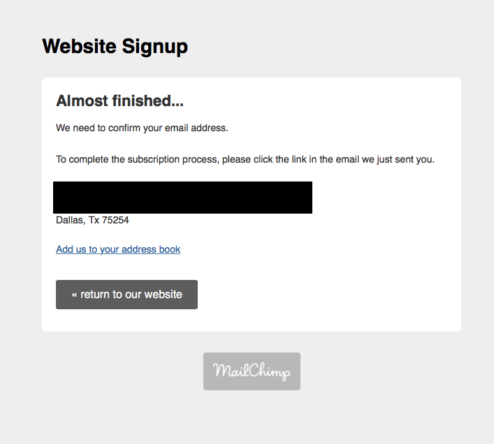
Bland. Dismissive. Dismissable.
Bland: There’s nothing engaging. No branding, except for their email service provider. Nothing reinforcing the value of my agreeing to do what the web page form asked me to do. This wasn’t even accurate. I didn’t sign up for a website, I signed up for their newsletter.
Dismissive: They’re done with me. They got my “conversion.” I can go back to their website, but they don’t give me a reason why I should.
Dismissable: So I do. No reason for me to stay on this page or do more on their website. Utterly forgettable. Will I remember why I said “yes” when I get my first newsletter?
As I’ve written before, I’m a big fan of thank you pages. Thank you pages are the pages of content that show up after you’ve gotten a conversion. You asked a visitor to take step X, and they did. Thank them! I think thank you pages have the potential to rock because I love good manners and hate wasted opportunities. Thank you pages are your best opportunity to show the former and avoid the latter.
[tweetthis]You asked a visitor to convert, and they did. Thank them![/tweetthis]
Showing consideration for people is the essence of good manners. The sophistication of today’s digital tools to personalize online experiences is increasing people’s expectations of how companies should treat people. Especially those people who’ve chosen to connect with them. Customer relationships and user experience are the new differentiators, so companies need to treat people as individuals.
So respect people; treat them well. Show them you appreciate that they’ve decided to give you their attention. Give them another reason to love your brand and want to do business with your company by writing a quality thank you page.
If you waste the opportunity a thank you page provides, remember that last post-conversion step is a zero-sum game. You’re either moving the relationship with this prospect forward or you’re not. Start thinking total lifetime value, not about the momentary success of conversion.
5 Parts of Awesome Thank You Pages
Regardless of the call-to-action on your web page, include these 5 parts on your thank you page.
- Thank them – explicitly. You don’t have to use the word “thanks,” but show genuine appreciation. Maybe you’re really excited to have them join your newsletter. Or send then good wishes: “Wear your new t-shirt in good health!” You can be creative here.
- Confirm they just made a really good decision. Buyer’s remorse is a real thing. Share another stat or testimonial that wasn’t on the original landing page that buttress any credibility builders you did include.
- Give them a chance to share the good news. Make your social share buttons obvious. You might even ask them explicitly to share in some way. Pre-fab a tweet (“I just bought this awesome t-shirt!”). Integrate a Facebook comments box on your page so they can comment right there. Give them a chance to share their delight.
- Make a new call-to-action (CTA) to push them further into your funnel. Make it relevant to the step they’ve just taken (good harmony and all that). It could be links to related content. Did they just start a free trial of your software? Embed or link some how-to videos. Did they just buy something from you? Take one more shot at cross-selling or ask them to join your Facebook group.
You can have multiple CTAs on your thank you page. Not so many that they’re overwhelmed though! Your landing page was about gearing them to take one key action. Now that they have, give them some options you can use to gauge where they are, especially if your using the landing page for lead gen. Test out where in the buyer journey they are.
[tweetthis]You can have multiple CTAs on your thank you page. Not so many that they’re overwhelmed though![/tweetthis]
What if The Salon, instead of showing me that canned, achieve-nothing thank you page, had asked me if I wanted to schedule an appointment and put up their phone number, or better yet – an online calendar?
- Re-introduce your website’s navigation bars and menus. At the very least, let them look around your website.
Don’t leave your just-converted customer wondering where to go next. Give them a way to go back to your main website. Presenting them with more CTAs and no way out won’t set the new relationship off on a good start.
Some Thank You Pages to Learn From (Or Not)
Let’s take a look at some thank you pages being used. I have three dueling pairs of thank you pages, one pair each for a:
- free trial
- content download
- webinar registration
But before that, here’s a better thank you page from the spa world. In truth, the dull thank you page at the top of this post was pretty much the same thank you page that three other Dallas salons sent me. (I’ve just moved; finding a new salon is stressful. It takes research. Really.)
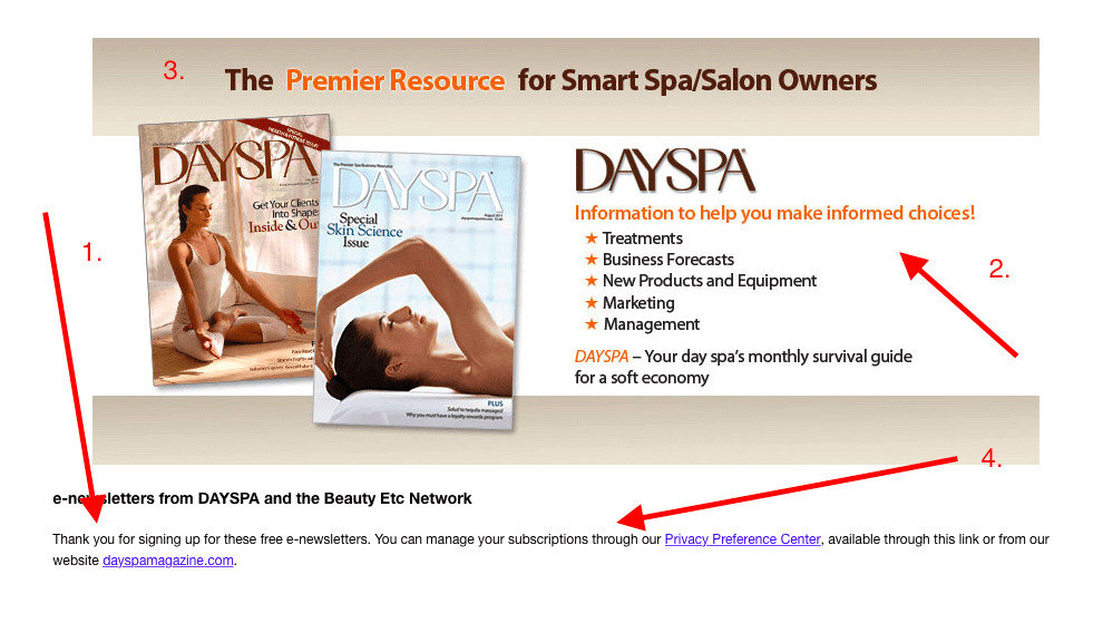
It’s not fabulous, but it’s a huge step above what The Salon had. What works:
- They said thank you!
- The reinforced the value they’re providing and my decision for signing up.
- They carried through their branding so the page looks like some thought went into it.
- They provided some basic instruction and help (I know; I’m stretching a bit here.)
What could they have done better? How about a couple images and links to recent articles I can check out right now? A request to follow them on Instagram or Twitter? Get me more engaged!
Anyway, onto the duels.
Duel #1: The Free Trial Thank You
I recently downloaded the free versions of Wunderlist and DocuSign, both of which have paid, premium versions.
Here’s Wunderlist’s thank you:
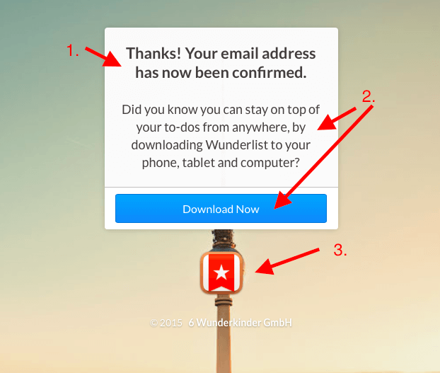
- The “Thanks,” along with confirmation that I’ve succeeded in the step I intended to take.
- Interesting mix of reinforcing the value of their offer and the decision I made with a second, strong CTA – to their download options page. I did download their app.
- Their branding here is only OK. I wasn’t familiar enough with them to immediately recognize that logo. Plus, it sits right on top of the only object in their hero image. Very hard to see. I found it a bit sloppy.
This is a good thank you page, except for how they presented their branding. I’ve used just a snippet of the full screen, because the rest of the screen was just filled with their hero image. Nothing else. A better image and clearer branding would make it better. But it did get me to download their app – so perhaps it does all it needs to do.
And now from Docusign:
DocuSign actually presented me with two thank you pages. The first, which is below, is what appeared right after I signed up. They sent me a second one after I confirmed my account. I’m sticking with the first since we’re looking at thank you pages that appear after you’ve clicked their webpage CTA.
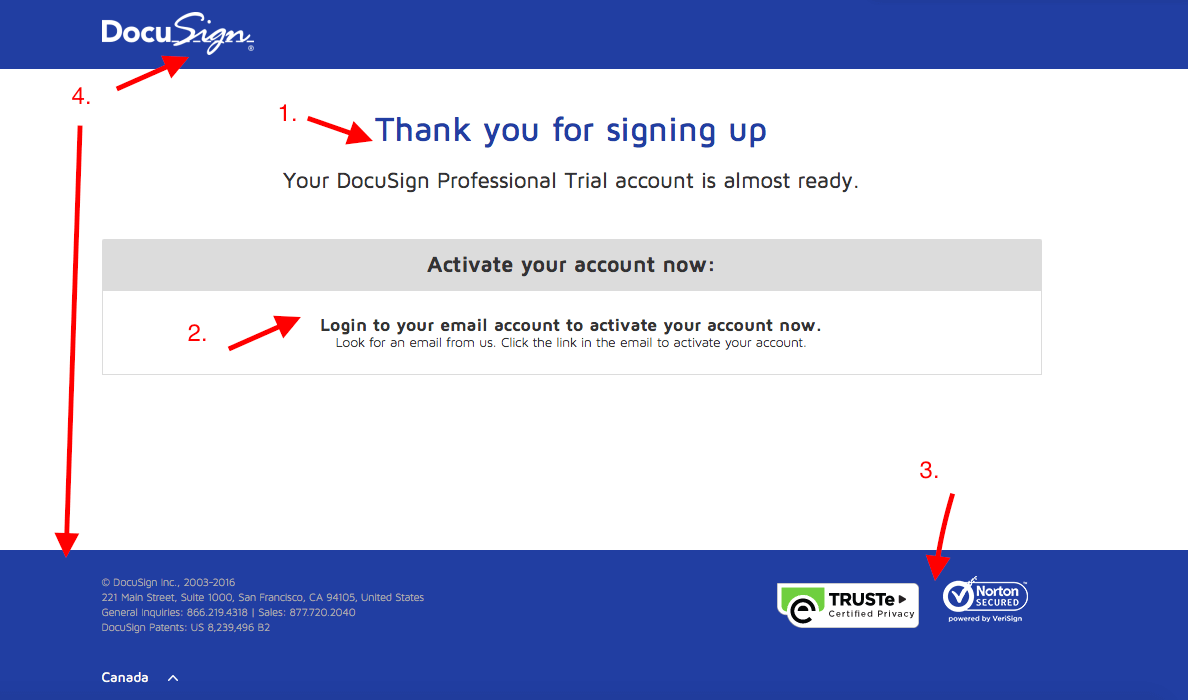
- I’m not going to stop appreciating that actual “thank you.”
- Clear, second CTA. The faster I start trying out my free trial, the more likely I’ll give it a good try throughout the trial period. So the more likely I’ll move to paid when my trial is over.
- Credibility builders, reassuring me I made a good choice signing up.
- Clear, consistent branding. I don’t feel like I’ve been taken somewhere new.
I really like this thank you page. It shuttles me along nicely right where DocuSign wants me to go, while treating me to a good user experience.
Duel #2: Content Downloads
Everyone (alright, the smart ones) are making premium content offers to capture leads. How effective is your post-download thank you page?
The first content thank you page in our duel is from KonnectAgain, a service designed to help schools engage alumni. Here’s the thank you page I got for filling out their premium content download CTA.
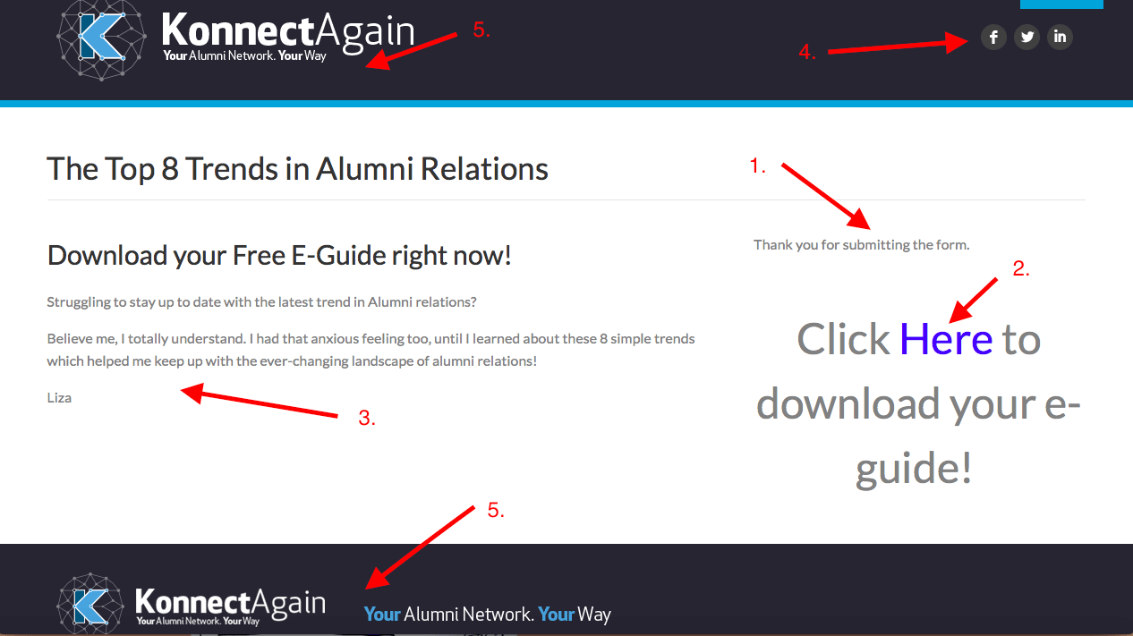
- Alright, so they did say thank you. Not the easiest to see, but it’s there.
- Love this trend of companies providing the download link right on the thank you page instead of waiting for the email.
- Is this a testimonial? I’m not sure who Liza is. I’m reading this as an effort to reinforce my good decision for wanting this report, but I wish the source of the comment was clearer.
- Social share buttons.
- The branded portions of the page boost their tag line. These portions are also the most visually pleasing, but it emphasizes the haphazard design of the middle portion of the page.
I also downloaded a report from Trackback, a solution for companies to manage and benefit from their online reviews.
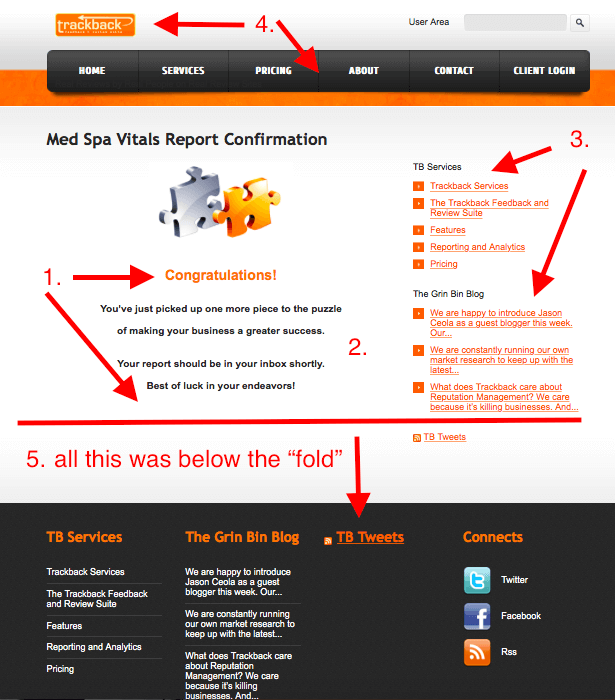
- A “Congratulations” combined with a “Best of luck…” Not a bad text alternative to “thank you.”
- Confirms my decision and tells me what to expect.
- They’ve decided to prioritize their selling options (links to their services), and then add their links to related content.
- Maintained branding and added back their navigation bar.
- They placed their social share buttons below the fold. They also repeated the same link options as those above the fold. In many cases, companies had no “below the fold.” Others just left the space below center page blank, which makes this a better use of the space than most.
Duel #3: Webinar Registrations
You’ll see a huge difference between the two thank you pages here. Both were the follow-up page to a webinar registration.

This is clearly the generic thank you page they use for all their webinars. You can see that since the big CTA button is to “View My Online Seminars.” Why not have a link or two to future, related webinars? Or to recordings of a relevant seminar that I missed?
This thank-you page does confirm that action I’ve taken and tell me what happens next. It certainly looks more professional than the first bland, dismissable thank you page at the top of this article. But it’s not doing a whole lot more.
Here is an example of a great post-webinar registration thank you page:
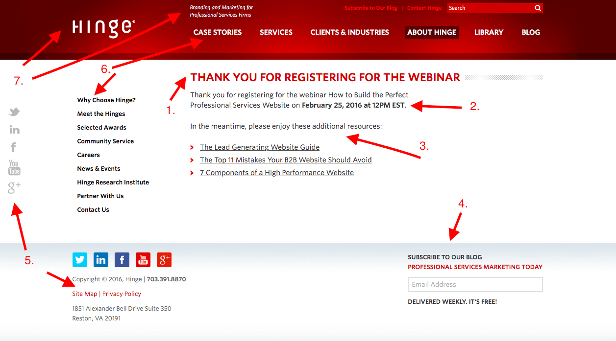
- Big thank you at the top of the visual hierarchy.
- Confirmation of all the relevant details.
- Links to other related content that might interest me.
- Second CTA to subscribe to their blog, also placed at top of the visual hierarchy by presenting the name of their blog in bright red.
- Social share opportunities abound.
- Navigation bars let visitors go wherever on the website matter most to her at that point.
- Clear, consistent branding.
Perhaps best of all, is that this thank you page does so much without looking cluttered or giving your eye no place to focus. My numbers and arrows muss it up a bit. But the soothing buff-colored background (white can be too harsh sometimes) with the selective use of bright red for key text.
Conclusion
For maximum conversions and goodwill, designing a pixel perfect landing page with Pagewiz is not enough. By using a stellar landing page or website and following it up with an out of this world thank you page, you increase the likelihood that your readers will come back and embrace more of your products.
My hope is that by showing you all these examples you see what a great difference a quality thank you page makes in the user experience your website or landing page provides. At it’s best, your thank you page keeps the visitor engaged with your company in that moment. At it’s worst, it’s the last of your online content they’ll interact with.
Have you seen some awesome or atrocious thank you pages? Share them with me and let me know what you think of them.
And thanks for staying with me through this post, despite that boring, forgettable thank you page sample at the open.
Elisa Silverman is a B2B content writer with a background in law and technology, who’s spent a career helping diverse groups of people communicate well with each other.
Also published on Medium.


