MailChimp is arguably the largest and most popular email service provider around. They allow you to send broadcast emails, scheduled newsletters and create an automated email drip campaign to large groups of people quickly and easily.
The application was created in 2001 by Ben Chestnut, Dan Kurzius, and Mark Armstrong – and was originally a side project. The system was built as a fun and simple alternative to competitors at the time who were using “big, bloated email software.”
MailChimp is known as a company who doesn’t take themselves too seriously. The attitude of fun is carried through in everything they do, from having a chimpanzee mascot named Frederick von Chimpenheimer IV, the introduction of emojis to their email templates, and the whimsical microcopy throughout their site.
The company currently has more than 14 million users. 203 billion emails were sent using their platform in 2015 with 1.2 billion sent on Black Friday alone.
Defining Moments
MailChimp’s success didn’t happen overnight. The application was available for 7 years until they started making headway. But CEO Ben Chestnut charts this slow burn as the reason for their success.
Spending “years building up a powerful, affordable, profitable, self-serve product” and getting “smarter at deliverability, scalability, and abuse prevention” helped them to refine their product.
Once MailChimp had the kinks ironed out, the biggest plot twist on their timeline history was to add a “freemium” option to their service. In 2009, they added a plan that allowed users to send mail to 500 subscribers for free. Their blog stated that their users grew from 85,000 to 450,000 in one year and the number of paying customers increased by 150% (and their profit by over 650%). Email drip campaigns played a huge part in these numbers, converting free users into paying customers.
Today MailChimp continues to use email campaigns for many things including customer conversion, client onboarding, upselling, and their newsletter “monkey wrench.” They even use their own tools to send and test their campaigns.
Email Drip Campaign Examples
Let’s look at some of MailChimp’s email campaigns and individual emails.
Onboarding Campaign
Onboarding campaigns are one of the most important for the success of your business. Lincoln Murphy of Sixteen Ventures hits the nail on the head saying, “…having a poor onboarding experience for your customers can pretty much kill your growth… if not your business.” It sets the frame for how the customer will view your company for the rest of your relationship.
Welcome Email
If onboarding is the most important campaign in your marketing strategy, then the welcome email is the most important email you will ever write for your business. This is the first communication you will have with your customer and you need to get it right.
Here’s MailChimp’s welcome email:

Pros
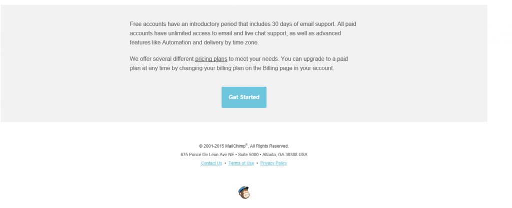
- When client onboarding or lead nurturing you need to build a personal relationship with your new subscriber, making them feel at ease and earning their trust. Even if an email is automated you can do this with the words you use and the tone of the message. HubSpot says that your campaign should, “be a deliberate effort to break down barriers with your prospects, inform them, and also build a personal relationship with them.” MailChimp gets off to a strong start, including the recipient’s name in the first line of the message. And although the MailChimp logo is digital, the handwritten look conveys a personal touch.
- The email contains one clear call to action button. This is extremely important as the call to action is the centerpiece of your email. It is generally the reason for sending the email in the first place and is what gets you those conversions. If your call to action is unclear, then your marketing efforts are wasted. Here, the wording used and minimal layout leaves no confusion about where you need to click to “Get Started” using MailChimp.
- The different colored icons at the top of each category help to segment the email, keeping it easy to read and follow for the user.
Cons
- MailChimp could have use a more playful tone in the message to create more of a connection with the reader. The language is very formal and matter-of-fact. Some colloquial or whimsical terms could have connected better with the reader and would support MailChimp’s fun-loving image.
- The email address makes no apologies about the email being automated. A personal looking email address with a sender name and a sign off at the bottom of the email would be better for instilling reader trust and making a connection.
[tweetthis]MailChimp’s success didn’t happen overnight. The application was available for 7 years they achieved success.[/tweetthis]
Helpful Hints
As part of a successful onboarding campaign, you need to offer value to your readers before you start selling. Pardot says, “You need to show your prospects that you understand the challenges they are facing and have the resources to help.” MailChimp gets a handle on this early on in their campaign.

Pros
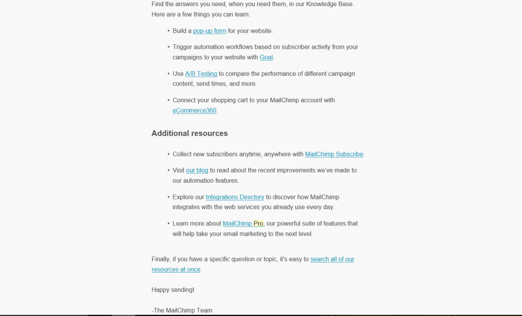
- The language in this email does a better job at connecting personally with the reader, casual phrases such as, “dig in,” make the message seem as though it’s from a friend talking conversationally, while the sign off, “Happy Sending,” seems caring.
- There is no selling in this message which is excellent at this stage in the onboarding process, there’s just a focus on helping the reader.
Cons
- The message gives the reader a lot to process at once. One of the benefits of a drip email campaign is that you can spoon feed readers large amounts of information. A separate message for each topic might have been better. Or, linking out to separate articles breaking down each section.
- There is no single, clear call to action. The message links to lots of different resources which are not very clear. Too many choices can overwhelm the reader. In a study by Optimizely, an email with one clear call to action had 13.3% more click-throughs than an email with more than one.
Checking In
It’s important to address users’ concerns as they arise throughout a campaign if you wish to maximize conversion. MailChimp tries to address any potential problems early on with this email.


Pros
- MailChimp connects with the reader in the first line by wishing them “Happy New Year,” continuing to build on the relationship built over previous emails. This is further enhanced with the message being signed off by “June Lee” an actual employee of MailChimp and a PS offering help if the user is still “getting their bearings.”
- The purpose of the email and the supporting call to action is crystal clear in this one.
- MailChimp’s chimp logo at the start of the message gives it a fun and relaxed feel, aligning with company values.
Cons
- Users may be put off by being asked to go out of their way to do something for a company they are yet to develop a strong relationship with. However, others may like the fact the company is striving to get it just right for them.
Upgrade Email
Upgrade emails can be added to a host of different campaigns at strategic times. Below is one of MailChimp’s emails promoting MailChimp Pro.

Pros
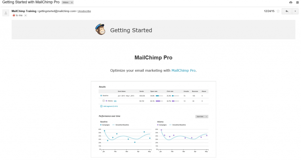
- MailChimp sends their MailChimp Pro emails with MailChimp Pro itself. They also made this information very public. Showing your customer that you have faith in your product by using it yourself to send emails to around 14,000,000 users is a great way to develop trust.
- Including a graphic of a chart helps to entice the reader into finding out more about the product as the metrics shown look quite impressive. Campaignmaster warns about putting one large image into emails as you may potentially trip a spam filter, but the ratio of text to image should be enough to avoid this in MailChimp’s case here.
Cons
- The language of this message is very technical and the terms, “comparative reports,” and, “aggregate,” may turn off less technically-minded readers.
- There is no call to action. How does the reader upgrade to Pro even if they wanted to? Adding a clear call to action button would likely increase MailChimp’s click-through rate.
Newsletter Email
Newsletter emails are a great tool for adding value to a campaign. They have the added bonus that not all the content in them has to be your own.

Pros
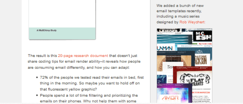
- It’s not a good idea to overwhelm readers and dilute your marketing message by including excessive information in drip emails, but in a newsletter where you have a lot to say, a table of contents can make your message more readable. Blue Fountain Media stresses the importance of breaking your message down in this way, “In a fast-paced medium such as email, a table of contents can be the difference between a user reading your content or not.”
- Different fonts throughout the message help to draw the reader’s eyes to headings and important information.
Cons
- The message may come off as busy and disjointed. For example, giving facts and figures related to one story in the sidebar, combined with ads for new, “email templates,” just below, can overwhelm and confuse the reader.
- Blue Fountain Media believes a good email should have, “a bold headline, one sentence of teaser copy, image support, and a strong call to action.” This email from MailChimp ticks all those boxes apart from the last and most important one – there is no clear call to action. This fact, coupled with the disorganized layout of the email, can lower conversions – although the contrasting color of the hyperlinks may help draw attention and clicks to them.
- A named greeting and a sign-off could have made the message more personal.
[tweetthis]A high percentage of MailChimp users are on the “freemium” plan.[/tweetthis]
Compare and Contrast: AWeber
AWeber is one of MailChimp’s main competitors in the field of email service providers and email marketing automation. Let’s take a look at how they craft some of their similar emails.
MailChimp’s version:


Pros
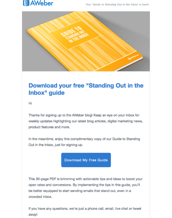
- AWeber’s welcome email has a much more personal feel than MailChimp’s. The language used is more casual and less matter-of-fact. Words such as, “brimming,” and, “boost,” make you feel like you’re reading a message from a friend, rather than a business.
- AWeber wins in the customer service department too, with their parting words, “if you have any questions, we’re just a phone call, email, live chat or tweet away,” offering the reader a real person to talk to through several mediums. MailChimp, on the other hand, lets the reader know they can have this service – if they upgrade their account.
Cons
- The main criticism of AWeber’s welcome email is that there is no sign-off at all, making it seem less personal.
Adding Value
MailChimp’s version:


Pros
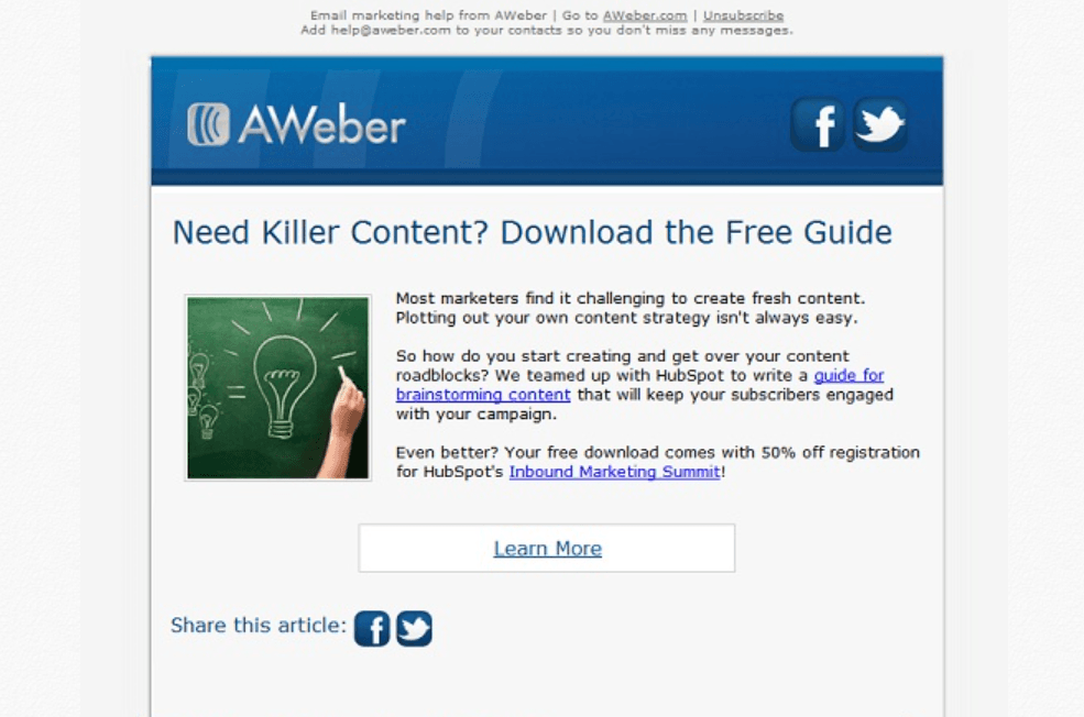
- Blue Fountain Media praises AWeber for adding an unsubscribe link at the top of the message, and the bottom. Providing an “easy exit for anyone who no longer wants their emails.” This may sound counterproductive as if you are actively encouraging your subscribers to unsubscribe. But, having people on your mailing list who don’t want your email accomplishes nothing – they will almost never convert into paid customers.
- AWeber’s email beats MailChimp’s for simplicity by picking one topic and hammering it home instead of trying to cover multiple areas.
- Adding social sharing buttons helps the email campaign kill two birds with one stone, covering multiple marketing platforms with one email.
Cons
- The call to action is weak here; it does have a separate box but the white color of the box and the dull font do not make it stand out. Although this is still one step ahead of MailChimp’s multiple hyperlinks with no single call to action.
- There is no greeting or sign-off in the message. MailChimp’s “MailChimp Team” is impersonal, but it’s better than nothing at all.
Email Campaigns and Pagewiz
Drip email campaigns combined with professionally designed, well-optimized landing pages make for an unbeatable combination.
Linking the call to action in your emails to a landing page optimized for conversions – rather than a generic homepage or unoptimized page on your site – will do wonders for your bottom line.
Pagewiz creates stunning landing page templates complete with free unlimited A/B testing so you can continually tweak your landing pages for the highest conversion rates.
And for MailChimp users, they have a built-in integration that makes it simple to combine the two and monitor the results.
Wrapping it Up
With a high percentage of users being on a “freemium” price plan, email campaigns are arguably more important to MailChimp’s success than they are to many of their competitors.
Freemium users must be nurtured, and a solid relationship built, before they can be converted into paying customers. MailChimp’s email drip campaign function does this well, helped by the fact their company persona is fun, friendly, and personal – which makes for an effective lead nurturing strategy because nobody wants to feel they’re being sold to.
Over to you – how are you using email drip campaigns in your business, and has seeing an analysis of MailChimp’s process given you any ideas?
Elna Cain is a professional writer living in Canada. She works closely with B2C and B2B businesses and has a background in marketing and psychology. She’s been featured on OptinMonster, Social Media Today, Blogging Wizard and is a Huffington Post contributor.
Also published on Medium.

