
How well-crafted landing pages increase conversion rates and grow your business
Creating high converting landing pages is key to growing your business online. And while the ‘gurus’ would have you believe it’s a secret art, you can actually learn the basic methods very quickly. How successful you are really depends on long term optimization and specifically A/B testing, which tells you which of your landing page versions work best.
But let’s start with the basics:
Pillar I: A Headline that Grabs Readers and Compels Them to Read More
As much as you’d like to think it’s your offer’s features, benefits, or price that make people read further, it all really starts in the headline. Those first few words have to be so engaging that your target audience can’t resist the urge to spend just a couple more minutes checking out your stuff. That means you have to make your key benefit crystal clear as soon as possible. You can also add a sub-headline to provide more detail, but it’s the main headline that will make the difference between browsers and buyers. So keep it short, to the point, and make it visually prominent in a large, bold, and colorful font.
Tip: The headline is the most important element of your landing page to optimize and test. Login to your Pagewiz account and create two landing page versions with everything identical but the headline message. See how your audience reacts – more often than not you’ll be surprised !
Pillar II: Easily Digestible Body Copy
Once you spend a couple of lines diving into your actual offer, quickly transition to bite-sized pieces of information that are easy to skim. One easy way to do this is with bullets, but you could also break up your body copy into short paragraphs. If you still find you’re left with large blocks of text, starting each text block with a paragraph does wonders for readability.
Tip: The Pagewiz templates have been tested in real campaigns, so make sure your body copy fits into the recommended text blocks for the best results
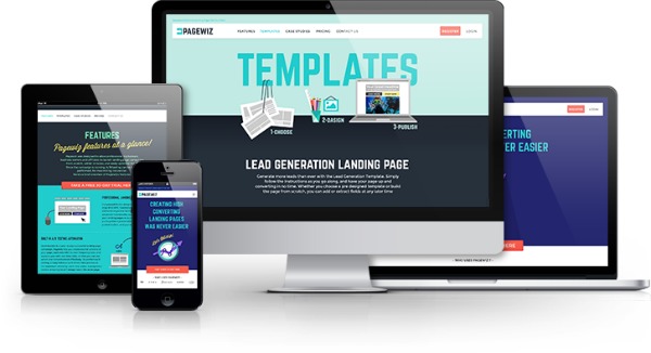
Pillar III: Visual Content
Visual content such as graphic elements and especially video can increase conversion rates dramatically. As the web becomes more visual, browsers expect to see more color on the screen. If they don’t, you’ll lose buyers.
Pillar IV: Call to Action
A great headline, flowing body copy, and even stunning visuals – will all fall flat if you don’t include at least one call to action. This could mean a request to fill out a form, a download button, or even an offer to purchase your product. Whatever your desired result, you absolutely must include this critical piece of the puzzle for your landing page to perform.
Depending on how detailed your landing page is, you might want to include more than one call to action. A standard best practice is to provide a prominent call to action at the top of the page right beside the headline. This area of the page is typically known as “above the fold”, which refers to the old sales letter days when readers would read past the fold of a page before reaching the offer pitch. In a landing page, the fold simply means the point of scrolling. Everything you see on the page without scrolling is “above the fold”, and elements you can only access by scrolling down are considered to be “below the fold”. Just to make sure all your bases are covered, include your call to action both above and below the fold.
If your call to action appears as a visual element such as a button, make sure it sticks out on the page with color and possibly very basic animation as you can see on the Pagewiz homepage.
Kobe joined Pagewiz as a campaigns manager & front end developer. He has 2.5 years of landing page campaigns creation experience and a passion for driving them towards a higher conversion rate.
On his free time, Kobe likes to go out for long runs along the riverbank, accompanied by his fast dog (Giga).

