

Welcome to chapter 2 of Optimize Me; let’s continue by taking a deeper look at how landing pages are constructed, and how A/B testing can serve as a great method for optimizing them. We will focus on three primary landing pages elements: Headlines, Layouts, and CTAs.

By A/B testing the offer and these landing pages elements we will be able to better understand what your customers want, and how should we communicate with them.
What your customers want
Start by thinking about your customer’s needs, what is he or she looking for? Begin a great
relationship with your clients by giving them exactly what they’re after. With A/B testing it’s possible to try different offers to get a better understanding of what motivates them. Is it a free E-book, a coupon, a free trial of your software? Test and find out what makes your clients tick. Remember that promoting only one offer per page is critical. Promoting more than one will in most cases confuse your visitors, and make it almost impossible to test.
Start creating your own landing pages with Pagewiz
Tips for making a good landing page offer
Make the visitor immediately understand what the offer is:
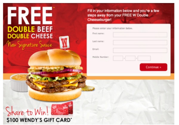
In this landing page the visitor immediately understands that by filling out the form he will receive a free Double Beef Double Cheese – Delicious!
Make your visitors immediately understand the benefit:

The visitor immediately understands that by using this service he might start earning more.
Make your visitors immediately understand how to get the offer:

This landing pages elements leave no questions to be asked, sign up and obtain the offer.
Understanding how to talk to your customers
Let’s say we found out exactly what kind of offer attracts our customers. We would now try to understand what kind of headline works best, what should be the layout of the landing page, and what kind of call to action will works best. This is where A/B testing really shines!
Breaking the landing page into different landing pages elements and evaluating exactly which element variants produce better results. Start by A/B testing your headings, while keeping the following in mind:
Make sure your headline gets the attention it deserves

Deliver a complete and simple message

Use the following techniques to construct effective headlines:
Ask a Direct Question
Headline Example: Does Your Internet Provider Give You Free Stuff?
Use Lists & Numbers
Headline Example: 10 Reasons Why You Should Start Working with Us
Create Curiosity
Headline Example: 3 Secrets That Rich People Don’t Want You to Know
Be Provocative
Headline Example: Learn How to Make Money without Having a Rich Father
State the Offer
Headline Example: Get Your Free 1 On 1 Course Today!
Methods for designing Layouts
Read and sign up!

Layout form: Headline on the left, drawing the reader directly into the body copy. When they’re done reading they immediately see the form and a big CTA button.
Straight in the middle

Layout form: Headline in the middle keeps everything in focus, leading to a short section of body copy and two big CTA buttons. The blue button on the left is one of the landing pages elements that draw more attention because of the word FREE – motivating the visitor to click on your landing pages elements and proceed.
See the video and sign up

Layout form: This landing page structure allows the visitor to scan, read the headline, watch the video and maybe even read the body text. Each of the landing pages elements gets the right amount of attention.
Learn what makes your visitors click on Your Landing Pages Elements
Calls-to-action are obviously very important. Without them visitors won’t know how to download your offer, where to register for the free e-book or how to subscribe to your great newsletter. Here are a few recommended approaches for designing powerful CTA buttons. Try them out and find out which one work best with your audience:
Use big text

Use a primary button and a secondary option

Present the incentive

Create urgency

Reduce anxiety

Additional CTA Tips:
Avoid using the old fashion “Submit” CTA button. It has been repeatedly proven to be intimidating.
When possible, don’t place your CTA buttons and other landing pages elements bellow the fold of the landing page, this will help your visitors understand exactly what they are supposed to do.
Final thought
We hope this two part article has given you the basic knowledge and assurance to start testing your landing pages too. As a last final thought, we would like to leave you with a quote from William Edwards, an American statistician, professor and author who said:
“If you cannot measure it, you cannot improve it”.
Happy Optimizing!

Oren Rachum is a copywriter with experience in advertising, online marketing, and online campaign optimization.
He also conducts professional workshops that help organizations improve their advertising work flow and results.

