Unless you’ve been living under a rock, you’d know that having a mobile-optimized site is critical for your online presence. Since the number of users accessing the Internet via mobile devices has increased, it’s important to increase your mobile landing page conversion rate.
According to ComScore, the number of people accessing the Internet via mobile devices has exceeded that of those using desktop.

More people are accessing the Internet via mobile devices.
Image source: http://www.smartinsights.com/
In 2015, time spent on mobile digital media by Internet users in the US is significantly higher at 51% compared to desktop’s share of 42%.

Mobile digital media time in the US has surpassed that of desktop in the US since 2014.
Image source: http://www.smartinsights.com/
It’s undeniable that if your website is not mobile-optimized, you’re not providing an optimal user experience for a large portion of your visitors. You’re missing out on sales and conversions.
Just having your site fit nicely on a mobile device is not enough. If you simply squeeze the desktop experience onto the small screen, you’re not optimizing the user experience and missing out on conversions.
In this article, we’ll look at 15 critical components on a mobile landing page that affect conversion rate:
1. Keep it concise
Being concise and to the point in your copy is always a good thing. It’s particularly important when writing for mobile landing pages because visitors quit when they have to scroll forever to read your wall of text.
Eliminate jargon and buzzwords that don’t add value to communicating the benefits to your customers of your products and services.
Cut out information that doesn’t contribute to describing your offering, and remove extraneous links that take visitors away from your page.
It’s also not realistic to cram everything above the fold onto a small screen. Include scroll cues on your page to encourage visitors to keep reading.
When using graphics, make sure they are directly related to the offer on the page. Images that look cool but do nothing to help visitors understand your offer is just taking up space.
2. Put your unique selling/value proposition front and center
What do you sell? What do your products or services do for your customers? How soon do your customers see it?
Remember, you have much less real estate to work with on mobile than desktop. Content that’s “above the fold” on desktop can easily be buried way down in the page on much smaller screens.
Make sure to position your unique value proposition at the top so it appears “above the fold” even on mobile. Use a clear and specific headline so visitors can tell right away how your products and services can benefit them.
Don’t forget to test that your message can be seen right at page load for the most popular devices.
3. Get them to call you
In this digital age, your visitors might see it as a chore to pick up the phone and give you a call.
But… what if your prospect is already browsing your site on the phone? They are already holding it!
[tweetthis]“61% of mobile users call after a local business search.” ~ Google Mobile Movement Study, 2011[/tweetthis]
If the next step in your user path is to call your company, make the phone number easy to locate. Make it stand out on your mobile landing page.
Not only that, make it a breeze for your prospects to call you. Put the number in a prominent position, and make it a click-to-call button (CTC) so the process is as painless as possible.
Here are a few click-to-call best practices to keep in mind:
- Include the international prefix in the code to make sure it works for global users.
- Use a phone icon so visitors can quickly understand the action required.
- Include a CTA in the text, such as “call now”, “tap to call” etc.
- Put the phone number in the link for transparency and easy verbal sharing.
- Display customer service hours close to the CTC so users won’t get frustrated when they are sent to voice mail during off hours.
- Test your call-t0-click CTA on multiple devices

Example of “click-to-call” on a mobile site.
Image source: https://www.tastyplacement.com
4. Focus on one call-to-action
Having one CTA is a best practice for any landing page, and it’s particularly important for mobile because visitors would have to scroll back and forth to find the CTA they want. Confused visitors are not clicking visitors.
However, you are not limited to having a single CTA button or link. Put a few CTA buttons for the same landing page down the length of the page so users don’t have to scroll around to look for them.
Mobile users tend to be goal-oriented, and a task completion CTA placed above the fold can help increase conversion.

Placing CTA above the fold can help increase conversion.
Image source: http://www.threedeepmarketing.com
As any good CTA, the copy needs to be specific, concise and customer-focused. “Continue” or “Sign Up” is not appealing enough to elicit an action, while buttons with a lot of copy could make the text barely legible on a small screen.
Don’t forget to make your CTA pop – it may sound obvious, but make a button look clickable!
5. Focus on customer benefits
You have limited real estate on mobile to communicate your products and services, so you have to make every word count by being concise.
Most users on mobile skim through a page before they decide if they want to read the details.
What pops on your page? Are they customer benefit oriented?
Use headers, bold typefaces and colors to highlight copy that communicates results and the benefits your products and services deliver to your customers.
6. Ditch the social sharing buttons (gasp!)
Social sharing buttons can be a distraction if the goal of the landing page is conversion.
You want your visitors to click on your CTA, not a sharing button.
Moreover, when your visitors are on mobile, they get taken to another page when clicking on the social share buttons. They can easily get sucked into what’s happening on their social media feed instead of returning to your page and completing the desired action.
In this case study, Taloon increased click through rate by 11% when they removed social share buttons on their product pages.

By removing the social share buttons at the bottom of their ebook landing page, Kuno Creative increased conversion by 18%.
Image source: http://thinksem.com
7. Strike a balance with white space
You don’t want your page to look crammed. That makes your mobile page hard to read and creates a poor user experience.
However, too much white space can unnecessarily bump content down the page, making your visitors scroll forever, increasing the chances of them navigating away before seeing your CTA.
Be mindful about white space between form fields. Too much can make the form appear long and hard to complete. However, too little space can make it hard for folks with “big thumbs.” Try to keep the spacing to ¼ inch.
8. Check your images
Depending on the code, not all images scale properly on mobile. What looks good on desktop can turn into a smudge. Images with copy are particularly tricky because when they’re scaled, the text can turn into the size of a sesame seed.
Same goes for background images. If the way they’re scaled turns out to be more of a distraction and doesn’t help communicate your offer, you may be better off by replacing it with a solid background color.
9. Show your products
A picture is worth a thousand words… and when you don’t have the real estate to put a thousand words on a small screen, a good quality image of a product can do a whole lot of heavy lifting without taking up the precious space where your CTA needs to go.
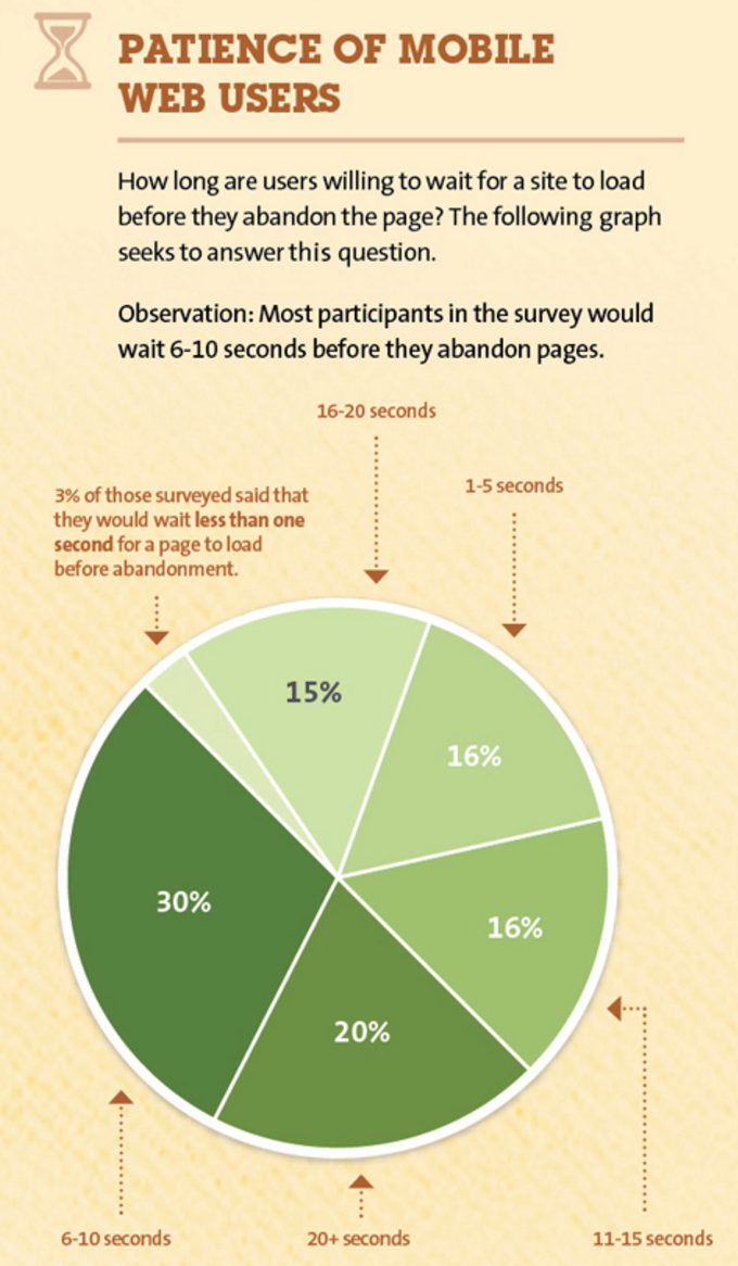
However, images have the potential to increase load time if not optimized properly. According to Kissmetrics, most visitors abandon a website if it takes more than 10 seconds to load.
If your visitors leave your site before your content loads, there’s no conversion!

How patient are mobile users? Don’t let your images slow your site down and drive them away.
Image source: https://blog.kissmetrics.com
Your images need to be large enough so your products are displayed properly, but also need to be properly optimized so they don’t impact load time to the point where visitors start abandoning your site.
Here are a few things to pay attention to when optimizing images for your mobile site:
- Choose clear, impactful images that are not too busy or complex. Details can be lost on the smaller screens.
- Use images that are of appropriate proportions as different devices may crop images differently.
- Upload images that are sized properly by identifying the largest pixel dimension needed and do not exceed that.
- Compress your images as much as possible while still appear sharp on high-resolution or Retina displays.

Compressing an image to make the file size smaller and improve load time.
Image source: https://www.marketing-partners.com
10. Ensure accessibility
Is all of your website’s content available and visible on mobile devices?
Flash, frames and some older plug-ins are not accessible for mobile.
Update your website’s code with mobile-friendly alternatives such as HTML5 and jQuery, and update all your plug-ins.
Before you roll out any update, audit the code and perform QA testing to make sure all updates and pages are mobile-friendly.

Oops! Flash is not supported on mobile device – don’t let this happen to your site!
Image source: http://www.threedeepmarketing.com
11. Pay attention to legibility
Visitors should be able to read your webpages without zooming on their mobile device. Google recommends a base font size of 16 pixels, and an arm’s length as a legibility guide for mobile for best usability.
To create a satisfactory user experience that can help increase conversion rates, you can further increase legibility by using a simple color palette, strong contrast between text and background, plus making use of negative space without stretching out the content too much.
[tweetthis]Google recommends a font size of 16 pixels, and an arm’s length for mobile legibility.[/tweetthis]
12. Make clicking easy
Your landing page is designed to get visitors to take specific action like calling, filling out a lead form, or purchasing a product. Make sure that the path to taht goal is clear of frustration. One of those hassles can be that the links are too small to click!
Ensure that your links and CTA are “thumb-friendly” – users should be able to click on them without zooming.
Microsoft suggests that the minimum target area should be 38×38 pixels, while Apple recommends 40×40 pixels.
Ideally, you won’t have multiple CTAs next to each other, but in case you do (and it’d better be for a very good reason!), use margins or add padding around clickable areas to avoid mis-clicks.

Example of thumb-friendly CTAs that are clearly separated to avoid mis-clicks.
Image source: http://www.threedeepmarketing.com
13. Leverage geo-data
A mobile user’s geographic location can typically be determined within 5 to 20 miles based on their IP addresses.
This gives brick-and-mortar stores a great opportunity to personalize locally relevant content and offer location-specific offers to attract customers into specific store locations.
Here are a few things to enhance geo-targeting on your mobile site:
- Customize heading with the visitor’s location
- Regionalize copy with local terms and slangs
- Provide map relevant to the user’s location
- Pre-populate forms with location information
14. Simplify forms
It’s not the easiest thing to type in a whole lot of information on a tiny mobile device. Forms should ask for minimal amount of information as additional fields can hinder conversion.
Your goal should be to capture the least amount of information that will allow you follow up on the lead.
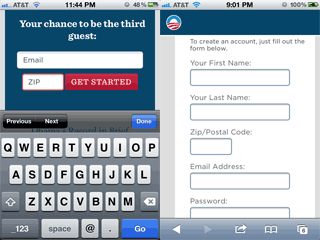
You can also use a two-step process if you have several required fields in order to break up the process and make the sign up look less daunting.

Example of a two-step process on a mobile landing page.
Image source: http://www.threedeepmarketing.com
15. Track and test
Mobile technology is changing fast, and users are adapting their behavior in response to those changes.
The best way to make sure that your mobile site is converting at a satisfactory rate, use A/B testing and heat map tracking to monitor your conversion rate.
Good user experience design that makes it easy for users to take action is imperative for any landing page, and even more important for mobile sites.
To sum up, here are few points to keep in mind:
- Be concise and brief
- Make it easy to find and click on your CTA
- Optimize load time
- Use simple and bold images
- Pay attention to formatting and legibility
- Test in multiple devices to make sure important message and CTA are visible
Next time, we’ll be talking more about how there is a correlation between boring content and low conversion rates.
Over to you – what improvements can you make on your landing pages to optimize user experience and increase conversion on mobile?
Mike Dane is a digital marketing professional currently working as a PR manager at TruConversion.com. He truly loves online marketing and anything digital. He is very focused on his clients. Once he starts work, he is fully committed to his duties and responsibilities at that company.


