When it comes to designing websites, ones with less accessibility lose sales to others. So here are some key reasons why we should focus on access, knowing our customer, and the ways we can increase conversion rates by optimizing it.
SEO and Accessibility are related. What can be read on screen readers can be indexed by search engines. This means that considering web content accessibility and SEO will keep all the people you’re trying to reach in the best position while creating a website.

When you design a better website, chances are that more people will use it. This means that people will have a better user experience, which will in turn lead to increased conversions, reduced friction and more revenue. The more effort you put into your website, the more your number of PPC generated sales will increase.
[tweetthis]With better design, people with disabilities will have a better user experience.[/tweetthis]
Steps on how to make forms more accessible:
Improve the tabbing navigation of the form
Tabbing order is the way in which we set an order through which a user navigates the given page, to go through the interactive elements and links. It is prudent to check every form and navigate through it by pressing the tab key and see that every field is easy to reach and you are able to navigate through the page.
Navigation is important to three types of people
- People who use keyboards.
- People who use mouses.
- People who use mobile phones.
When it comes to tabbing, things may get a bit difficult if your setup is not properly configured. People will not be able to complete a form if the tabbing order is inappropriate or it misses an important element of implementation. When it comes to mobile devices, the keyboard action needs to be quick and if the tabbing isn’t implemented correctly, then the cursor will move on different places on the form leaving behind the unmarked fields.
You can solve this problem by rewriting the source code, which will set the tab flow for the whole page, or, if you desire, you can set the tab order using the tab index.
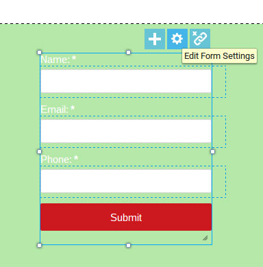
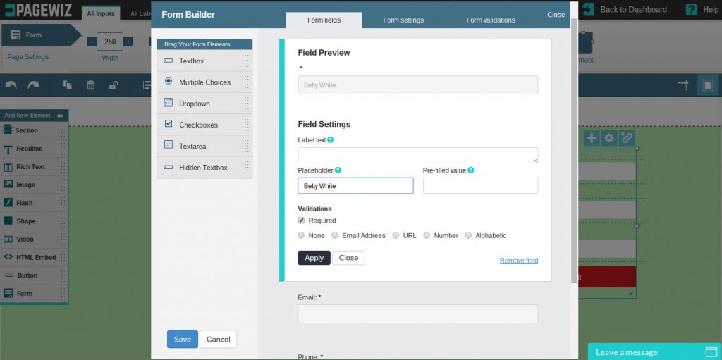
On landing pages, tabbing order is easily managed from the Pagewiz designer. As you build your campaign, you can unlock the fields to change their positioning on the page or edit them in the designer by selecting the gear-shaped icon after single-clicking on the form and opening the Form Builder.

Precautionary note: If you select the “link” icon on the right of the settings icon in order to unlock the fields, you will need to open form builder to put them in a corresponding order to ensure that a customer can tab through your form.

Properly labeling the fields
The labels used in the fields should be very clear. When it comes to people using screen readers, the text used for your label is very important. It needs to be very specific so that people can complete the form quickly. If you will not be using a label next to your form fields in this instance, it is very important to use a placeholder.
Creating a placeholder in Pagewiz can be done with ease. Simply click the menu to build a new form, and navigate to the “form fields” in the form builder. You will be able to see the placeholder option there.

Be specific about data inputs
We have seen how we can write labels, so now we will discuss how to specify a data format. In the case of entering the password there come some instructions. If you tell the users what you expect from them in the first place so that they don’t have to keep on entering it again and again.
Another example of of this concern is the date field. Different countries follow different date formats, so it is necessary to specify in advance what format you expect.
Another place where people face an issue is the name field. Many people have long names, so fields with character limits will stop them from completing the form. Others who don’t use middle names and last names face a similar issue. You need to make sure that you don’t lose conversions due to cultural differences.

Build better error validation
Most of the time proper labeling and flexible data formats stop people from making errors. People make mistakes. But when they are not able to solve the issue, they will quit filling the form. Proper error messages will save you from losing such people.
Simply highlighting the issue with red color is not enough. People with color blindness will not be able to spot it, so you need to give the user a clear error message on the page.
A proper error message lets people know the problem. They can fix it on their own.
[tweetthis]Error messages can be avoided by designing your forms in an intuitive way. [/tweetthis]
Using a proper icon font
Icon fonts are used to graphically represent an idea. They are used at different areas of a form so that people can understand the form better. Most of the time the pages with icons take more time to download, which increases the bounce rate. People with dyslexia sometimes miss these icons, so using them alone to deliver the message means you are will miss out on some conversions.
When it comes to drop-down menus, users need to interact with the menu many times in order to perform the task. Keyboard users and people with limited motor skills may take more time to use the drop down menu.
For these users, keying in the option is better than choosing and making a selection from a menu, where you need to go from one option to another to finalize a selection.
Autocomplete is a helpful option in this case. A number of suggestions can appear on the screen when a person starts to type a word. This will help in faster selection and filling the form.
For users with screen readers, autocomplete is not an option. They need to convert out of the form mode.
Luke Wroblewski has discussed the ill effects of using drop-downs and has suggested some alternatives:
- Plus and minus buttons used to specify some number called “steppers.”
- A group of selection buttons from which you can only select one called “radio buttons.”
- Switches, which can be used to enable and disable filters.
- Specify a range using sliders.
- Button input fields
- Single input fields instead of drop-downs, such as date selection.
Getting the right information to a screen reader can greatly improve the life of a person with disabilities. This TED talk given by Ron McCallum shows how important this technology can be.
Say no to CAPTCHA
We have all heard the saying that conversions go low with CAPTCHA. Yet many sites are using CAPTCHA codes. They are the best way to avoid spam on the website. The sad part is that it is also the easy way to keep people away and stop them from filling out forms. They can reduce conversion rates and can be the reason for a bad user experience.
Some of the reasons how CAPTCHA is effecting conversions:
- It has to be noted that people try to complete them, but 30% of CAPTCHA failures are experienced by people.
- A recent study conducted on CAPTCHA codes and user experience shows that 23% of people were not able to get the CAPTCHA codes right in the first place and that 15% were not able to complete the codes.
- They are not suitable for people with disabilities as screen readers fail to read CAPTCHA.
- It took about almost 65 seconds for blind users, who were trying to complete the task using audio CAPTCHA.

CAPTCHA alternatives
For better conversions, it is necessary to have better alternatives to CAPTCHA.
Create an option to skip CAPTCHA. People who skip CAPTCHA should be given the option to enter their mobile phone number in order to verify.
The checkbox for “I am not a robot” is made using JavaScript and so for the same reason, should not be detected by the spam bots. You can also go for Google’s no CAPTCHA reCAPTCHA as they are read by keyboards, voice input software as well as screen readers. You must take care as you implement this in your form as many reports suggest that it kills conversions.
When registering with a form, your user can choose the option of email, where a recipient will be sent an email along with a confirmation link to confirm that they are a real user.
Things that CAPTCHAs should avoid
Honey Pots
These are the hidden fields, which will not be read by normal users, but can be spotted by the spam bots. The sad part is that they are also read by screen readers, so the people using them will fall for it. This may lead to lower rates of conversion.
Gamified CAPTCHAs
Then there’s gamified CAPTCHAs, which ask people to make a virtual cup of hot chocolate. However, there are some problems in using this:
- People who have restricted motor skills will not be able to solve the problem, as they will not be able to drag the mouse.
- You need to find an alternative for blind people.
- Cultural differences can make them inaccessible.
[tweetthis]Captchas can keep spam from reaching you, but they might also be too difficult for some disabled users.[/tweetthis]
In Conclusion
Accessibility is a concern that covers many areas. Captcha, ensuring forms are tightly designed, and so much more is vitally important to engaging your reader to click through. Designing your site so that all these areas integrate well is part of a great user experience, which leads to better conversion rates.
These accessibility concerns aren’t the only way you can optimize your conversion rates. When you utilize all the functionality of your Pagewiz account, you can capture leads with ease as users engage with your content by launching your campaign with a few clicks and experiment with easily implemented A/B testing options for your landing pages.
Christopher Meloni is a Marketing Manager at Dealslands.co.uk a fast growing Online Coupon Industry. Apart from his profession, he also has a passion for the E-commerce Industry and it’s branding, and likes to explore new and innovative methods of marketing within his field.


