How easily can visitors to your landing page find your call-to-action (CTA) button?
If your answer wasn’t “How can they miss it?!” – then you may have some work to do.
The formatting of your CTA button is a critical part of designing a landing page that converts. Pay attention to these design aspects of your CTA button:
- placement
- color
- size
- shape
- the button’s immediate surroundings
As always with landing page, there are two key ideas to remember when writing and designing yours:
- Don’t make your reader work that hard!
- YMMV, so test out of which CTA buttons are really working best on your landing pages.
With those two principles in mind, let’s go.
Start creating your own landing pages with Pagewiz
Location, Location, Location

The common wisdom that your CTA should always be above the fold is slowly getting debunked. Partly, in no doubt, due to this post from Kissmetrics that shares a number of case studies on CTA location. It showed that an above the fold CTA didn’t always convert better. The reason given for this seemingly unexpected result is simple: Your CTA needs to be placed at the point where you’ve given your reader enough motivation to take action.
In other words, a beautiful, clean landing page design with a CTA button taking up half the above the fold real estate isn’t going to be effective on readers you’ve not yet convinced action is worth taking. Despite all the reports on how visual we’re all becoming, we do still need to use our words to make a conversion.
What does this mean for you?
When deciding where to place your CTA, consider the complexity of the offer you’re making and how knowledgable you expect your average visitor to be about you or what you’re offering. The more complex your offering and less knowledgable your audience is, the more information a reader will need before being motivated to act.
If you find that the copy you need to make your first, best case pushes your CTA below the fold, you can use other visual clues to keep your reader’s eyes moving down, like vertical lines or arrows pointing downwards. More important though is that your copy holds the reader’s interest down to the CTA.
One last note on placement: If your landing page is long, you will want to have a number of CTA buttons dropped throughout. Don’t make your reader scroll around too much to find a place to take action.
Using the principle of sufficient motivation described above, place additional CTA buttons at other points where your landing page copy has made another good case for action. This can be after another group of features/benefits or after addressing another common objection.
The Color of Conversion
There’s been a lot of testing on what button color converts best. Green? Red? Orange? Blue? The answer seems to be, on this issue more than perhaps any other – it depends.
What is clear is that the color of the CTA button needs to stand-out from the rest of the color scheme of the page. So an orange CTA button may work well on page made up of shades of blue, but less so on a page where red is dominant.
Look at the screen where you’ve placed a CTA button. What’s the first thing that attracts your eyes? If it’s not your CTA button, changing the color may be a good tweak to make in an A/B test. Here’s a great tool that helps you identify strongly contrasting colors that are still visually pleasing.
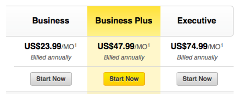
Do you have more than one CTA on your page? Use of a highlighting color is a great way to direct visitors to the offer you really want them to take. Below are the CTA buttons for LinkedIn’s Premium service. Not subtle at all. And that’s OK.

The Perfect Size
When it comes to the size of your CTA button, think Little Red Riding Hood. Too small and your CTA might not get noticed. Too large, and it can throw off the balance of the entire page and crowd out space for motivating copy.
You do want your CTA button to be larger than other design elements around it, because that will deliver the message that this button is important. However, the degree of how much larger should be in proportion to everything else the visitor sees on the page at the same time.
Thinking Outside the Rectangle
Using a creative shape for your CTA button is another way to make it stand out to your reader without screaming at them. It doesn’t even have to be geometric.
One last note about shape: Make sure your CTA button looks clickable. Keep this in mind even if you do stick with a rectangle. Dispatch.com makes sure there’s no question what to do here:

You can also use shading, borders, and other design elements that provide some depth to show clickability. How you use the CTA’s immediate surroundings helps as well.
About that… Immediate Surroundings
The space around your CTA either contributes to your CTA’s effectiveness, or detracts from it. Avoid clutter in the area that surrounds your CTA. A nice plain of white space will help your CTA stand out.
This expanse of white space doesn’t need to be entirely empty, as long as what’s there is pushing attention to your CTA. In fact, using another visual element and/or snippet of copy here can be a potent tool in boosting conversions.
Take a look at this CTA button from Wix.com:

An arrow points readers directly to the button. The copy is one last push reiterating a key benefit of taking action.
Last, here’s a good example from Shopify.com that uses a number of the design elements discussed here:

The CTA button is a pleasing, yet contrasting and obvious color. There’s muted white space all around it, but with a supporting copy and design that pushes you to action.
Your Quick Cheatsheet for Designing a CTA Button
- Don’t be a slave to above the fold placement. Place your CTA only after you’ve presented a good a case for action.
- Use a contrasting color.
- Make the CTA button larger than the elements around it, but proportional.
- Your CTA button doesn’t have to be a rectangle, but it does need to look clickable.
- Keep the area around your CTA button clear, except for copy and/or design elements that push attention towards and it and reinforce the motivation for taking action.
Elisa Silverman is a B2B content writer with a background in law and technology, who’s spent a career helping diverse groups of people communicate well with each other.


